

Remember those struggles that you faced when you wanted to center something inside a div in HTML and the way how you would do was using positions or margins. Such an headache it was but no more because FlexBox to the rescue!!!
If you want to make your already tough life a bit easy, you need to learn CSS-Flexbox. Flexbox is one of the most powerful tools in CSS. It comes handy when you want to make a page responsive or align contents in center or organise objects in a certain pattern, reverse the order, Flexbox has got you back.
Enough of talking let's starts with FlexBox:
But first!!! some basics that we need to discuss.
Axis of an HTML container
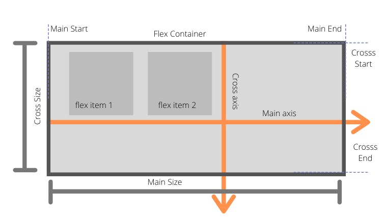
Webpage: For a webpage, the main axis is from left to right and the cross axis is from top to bottom.
Mobile: For a mobile, the main axis is from top to bottom, and the cross axis is from left to right.
This concept if very important to know what is happening when Flexbox properties are given.
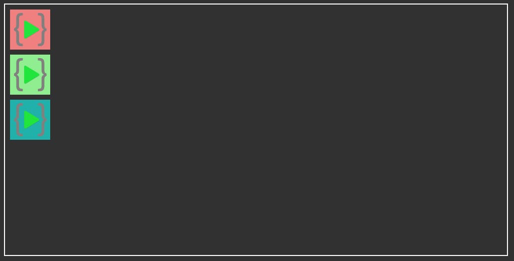
HTML
  <body>
    <div class="parent">
      <div class="child">
        <img src="./LCO Logo.png" alt="image1" id="image1" />
      </div>
      <div class="child">
        <img src="./LCO Logo.png" alt="image2" id="image2" />
      </div>
      <div class="child">
        <img src="./LCO Logo.png" alt="image3" id="image3" />
      </div>
    </div>
  </body>
CSS
.parent {
    width: 1000px;
    height: 500px;
   border: 2px solid white;
  }
  .child {
    height: 80px;
    margin: 10px;
  }
  .child img {
    height: 100%;
  }

  #image1 {
    background-color: lightcoral;
  }

  #image2 {
    background-color: lightgreen;
  }

  #image3 {
    background-color: lightseagreen;
  }
Output
Flex properties can be divided between Parent and child.
Let's start with Parent properties.
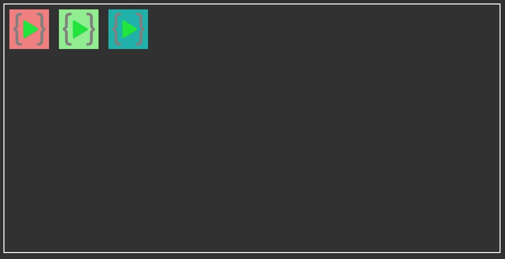
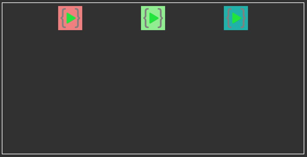
Display: Flex
if you want to make a div (parent-div) flex then you need to always give display: flex in the CSS of the parent div.
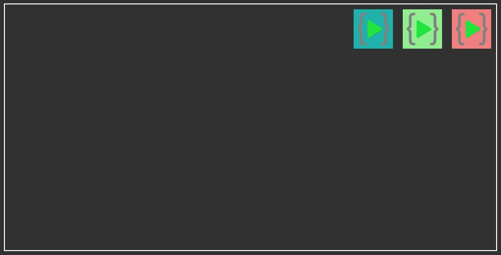
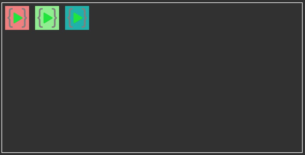
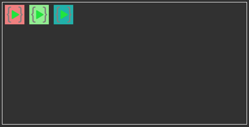
All the child elements will get into a row by default.
CSS
.parent {
    display: flex;
    width: 1000px;
    height: 500px;
    border: 2px solid white;
  }
Output
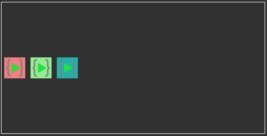
flex-direction
flex-direction specifies the direction and order of the child components inside in a parent components. By default the direction of component are set as row
flex-direction: row | row-reverse | column | column-reverse;
.parent {
    display: flex;
    flex-direction: row;
    width: 1000px;
    height: 1000px;
  }
flex-direction: row;
By default the direction is row. All the child elements are arranged in a row from left to right.
Output

flex-direction: row-reverse;
The child elements are arranged in row but in reverse order from right to left and at the opposite end of the box.
Output
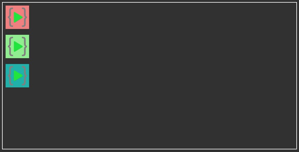
flex-direction: column;
The child elements are arranged in the cross-axis direction from top to bottom.
Output
flex-direction: column-reverse;
The child elements are arranged in the cross-axis direction but in reverse order from bottom to top.
Output
Justify-content
justify-content arranges the child components in main-axis direction. For row direction the components are set horizontally and for column direction the components are set vertically.
justify-content: center | flex-start | flext-end;
justify-content: space-around | space-between | space-evenly;
.parent {
    display: flex;
    justify-content: center;
    width: 1000px;
    height: 500px;
    border: 2px solid white;
  }
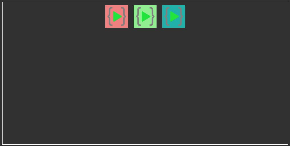
justify-content: center;
The child elements are arranged in the center of the parent div.
Output
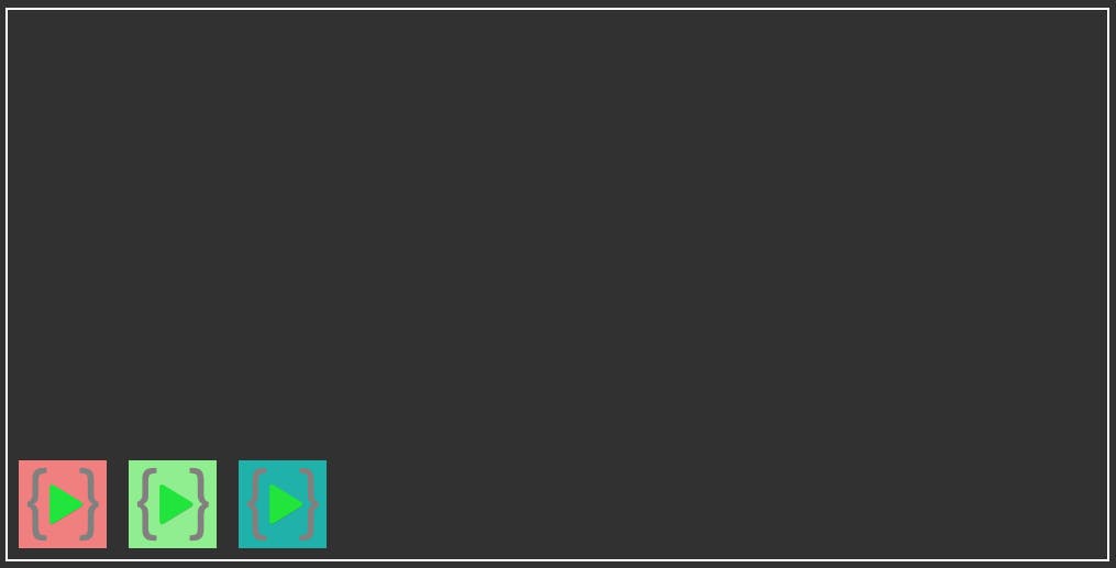
justify-content: flex-start;
The child elements are arranged in the start of the parent div.
Output
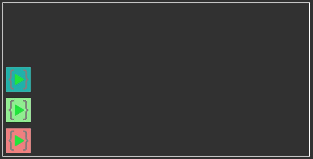
justify-content: flex-end;
The child elements are arranged in the end of the parent div.
Output
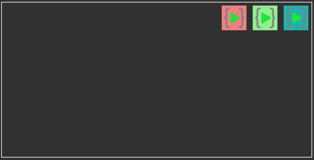
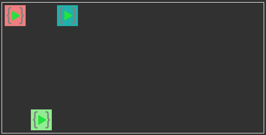
justify-content: space-around;
The child elements are arranged with space around and in between.
Output
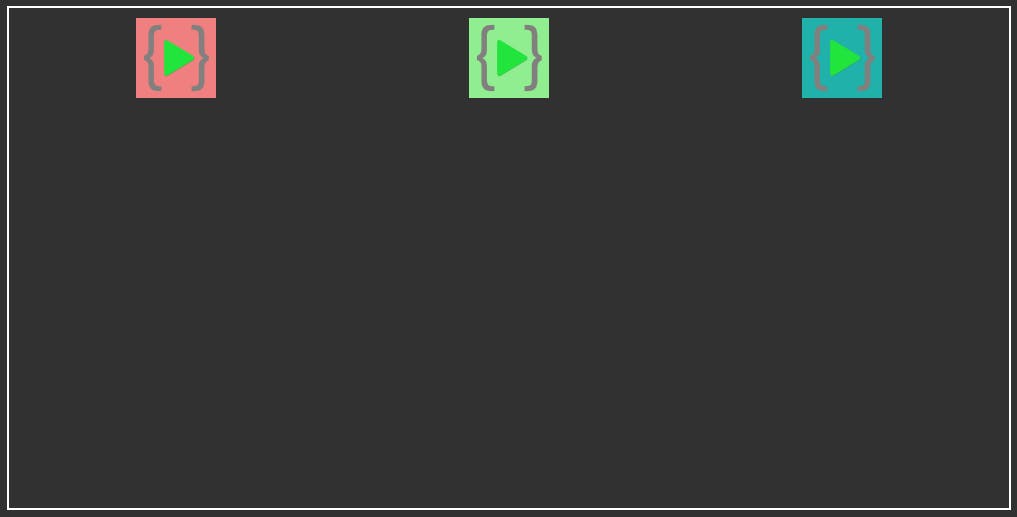
justify-content: space-between;
The child elements are arranged with space only in between.
Output
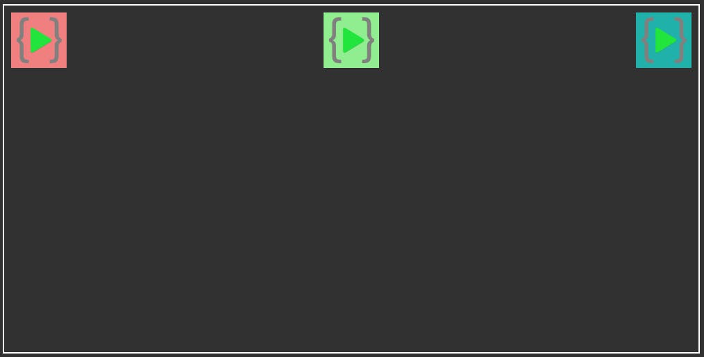
flex-direction: space-evenly;
The child elements are arranged with space around and in between with equal space.
Output
Align-items
align-items arranges the child components in cross-axis direction. For row direction the components are set vertically and for column direction the components are set horizontally.
align-items: center | flex-start | flex-end;
.parent {
    display: flex;
    align-items: center;
    width: 1000px;
    height: 500px;
    border: 2px solid white;
  }
align-items: center;
The child elements are arranged in the center of the parent div.
Output
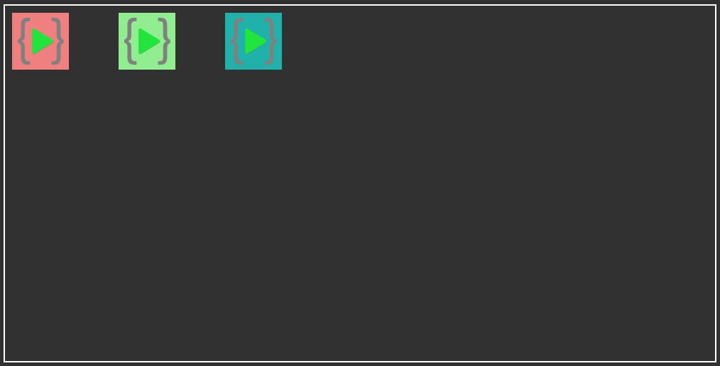
align-items: flex-start;
The child elements are arranged in the start of the parent div.
Output

align-items: flex-end;
The child elements are arranged in the end of the parent div.
Output
Gap properties
Gap property controls the gap between the child elements. The space is placed only between the items and not on the outer edges.
  gap: 50px;
  gap: 50px 50px;
  row-gap: 50px;
  column-gap: 50px;
.parent {
    display: flex;
    gap: 50px;
    width: 1000px;
    height: 500px;
    border: 2px solid white;
  }
row-gap: 50px;
row-gap: give space between two items placed horizontally. (left and right)
column-gap: 50px;
column-gap: give space between two items placed vertically (up and down).
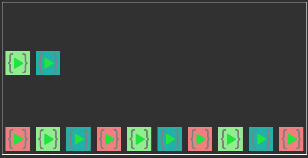
Flex-wrap
flex-wrap allows the child elements to wrap once they reach the end of the container.
flex-wrap: nowrap | wrap | wrap-reverse;
.parent {
  display: flex;
  /* flex-wrap: wrap; */
  width: 1000px;
  height: 500px;
  border: 2px solid white;
}
flex-wrap: nowrap;
flex-wrap: nowrap; is the default property. No wrap is done is child elements reach the ends of container.
.parent {
  display: flex;
  flex-wrap: nowrap;
  width: 1000px;
  height: 500px;
  border: 2px solid white;
}
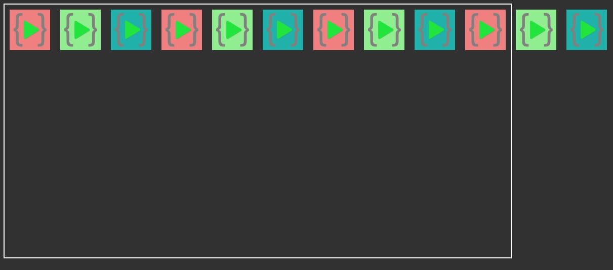
flex-wrap: wrap;
The child elements wrap inside the container.
.parent {
  display: flex;
  flex-wrap: wrap;
  width: 1000px;
  height: 500px;
  border: 2px solid white;
}
Output
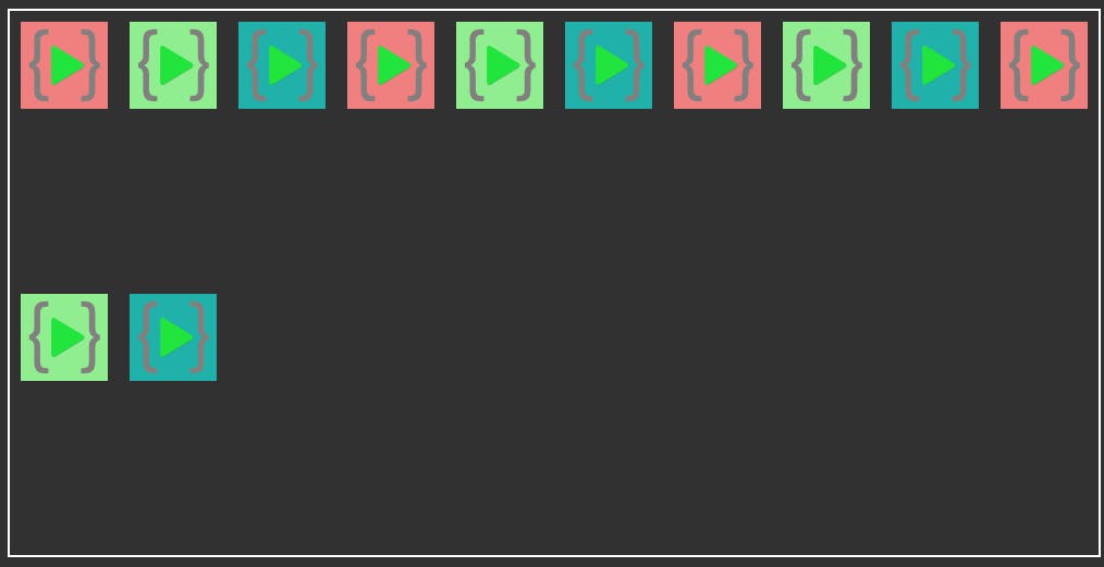
flex-wrap: wrap-reverse;
The child elements wrap in the reverse order inside the container from the opposite side.
.parent {
  display: flex;
  flex-wrap: wrap-reverse;
  width: 1000px;
  height: 500px;
  border: 2px solid white;
}
Output
##Child Properties
Child properties are applicable to the child elements which have their parent element as display: flex;
###HTML
<div class="parent">
      <div class="child" id="child1">
        <img src="./LCO Logo.png" alt="image1" id="image1" />
      </div>
      <div class="child" id="child2">
        <img src="./LCO Logo.png" alt="image2" id="image2" />
      </div>
      <div class="child" id="child3">
        <img src="./LCO Logo.png" alt="image3" id="image3" />
      </div>
 </div>
CSS
.parent {
    width: 1000px;
    height: 500px;
    border: 2px solid white;
  }
Align-self
align-self: center | flex-end | flex-start;
Align self is applicable to the child element it works similar to align-items but for the individual child component.
align-self: center;
#child2 {
    align-self: center;
  }
Output
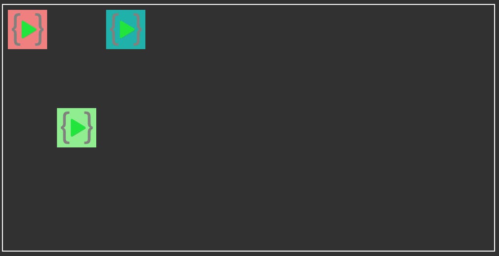
align-self: flex-start;
#child2 {
    align-self: flex-start;
  }
Output
align-self: flex-end;
#child2 {
    align-self: flex-end;
  }
Output
These were the most important flex-box properties which can make your life much easy. Flex-box is much more than this which you can always explore. This is enough to get started with flex-box.
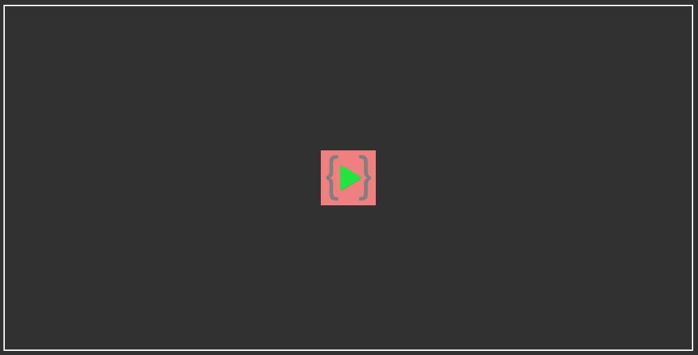
One important thing that started this whole conversation. Aligning the element at the center of the div.
##HTML
<div class="parent">
      <div class="child" id="child1">
        <img src="./LCO Logo.png" alt="image1" id="image1" />
      </div>
 </div>
#CSS
.parent {
    display: flex;
    align-items: center;
    justify-content: center;
    width: 1000px;
    height: 500px;
    border: 2px solid white;
  }
Output
Thank you for reading this article. Happy Coding !!!